
These are my top 10 logos of all time. I’ve chosen logos that I have a connection with and logos that have inspired me throughout the years.
1. Fed X
This has been my favourite logo for years simply because of the typeface and colour scheme, however when I started college I was giving a branding lecture and found out much more about this logo. My tutor pointed out that there was an arrow between the e and the x. I was amazed that I never spotted this after seeing it so many times throughout the years. Every time I see this logo I always question it. Did the designer mean to do this? Have the van drivers even spotted this?. This brings a secret touch to the logo and this is why I like it.
![]()
2. More 4
I’m always watching Grand Designs and this logo is always presented in the top left corner. The lifestyle programmes that are shown on More 4 bring a very modern homely feel. The logo totally backs this up and the way it brings a very colourful bright mood makes you enjoy channel 4 as well as the programme that’s on. The logo has 15 different colour palettes, the range of colours an overall brightness is what makes this logo work.
![]()
3. Jack Daniel’s
For years this logo has always been one of my favourites. Every bar you walk into this is the bottle that always stands out for me. The vintage style typography and the simplicity is what makes this brand work. This logo has moved onto stationary, t-shirts, key rings and a lot more. It’s a well-known brand simply because of the typeface. 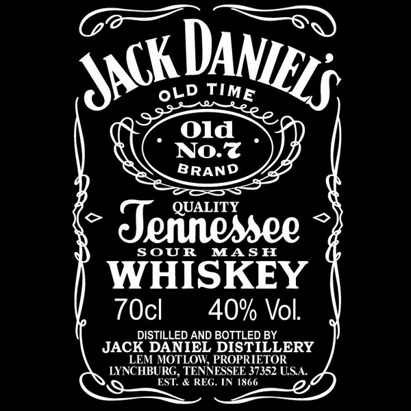
4. Starbucks
I don’t know what it is about this logo but every time I walk past the cafe it grabs my attention straight away. The illustrated style has been done very well and the simplicity of the colour scheme is amazing. The background of this logo and the way its developed throughout the years make you almost respect it more and take it the overall design. Another feature of the logo is the colour scheme. This colour green always sticks in my head if I see any colours similar it always reminds me of the Starbuck’s logo.
![]()
5. Coca-Cola
I’ve always respected this logo by the heritage and history behind it. The calligraphy style typeface is so well-known and popular you see it everywhere. The main element is the colour, this red is bright and crisps especially when presented on the coke cans. No matter where you are around the world you’ll always be in touch with this brand. Widely know and very historic.
![]()
6. BP
There is something about this logo that always catches my eye. The idea behind the colour scheme and the different shades are just amazing. The petrol stations you visit with this brand alway tries to tell you something. Provides a much greener solution and creates a very friendly approach to the public. Most people may be clueless about what this brand actually mean but Its giving you clues just from the colour scheme.
![]()
7. Rolex
Every time I watch the F1 I always see this logo. We all know the watches the brand produce are very high market and I think the logo relates to this. The crown is widely known as a upper class element so the fact the brand went for this in their logo tells you about their brand straight away. The typeface also has the modernist approach but includes a historic side to it also. You’ll never see this brand in your local shops you’ll always find it in town or in places the easy class or money. If I didn’t know this logo and seen it on the high street I would automatically think it has some wealth to it. For this reason I think the logo is very successful.
![]()
8. Levis
I’ve always bought Levis and it’s the way they present the brand that makes it unique. Their jeans bring a very cool comfort fit and I think this logo offers that. Every levi shop I visit it always brings a very vintage approach to the decoration and style to the shop. You always respect the shop simply because of the origins of the brand. The colour scheme with the red has always worked for them, looks even better when present on the denim jeans.
![]()
9. Pandora
There are plenty of logo our there that offer this layout and approach, However Pandora added a very modernised touch to their logo especially with the typeface and the ring for the o. You respect the brand more when you walk into one of their stores. The attention to detail in the way they present the brand is just amazing and it can always be related to the logo. Very neat, simplistic and modern it’s what most people want in a logo.
![]()
10. Budweiser
As far as brands go I think this is one of the coolest, from the adverts to the funny slogans Budweiser always offer that friendly atmosphere. From understanding the background you can start to relate it to the logo. You wouldn’t often use the typeface this designer has used but it just seems to work especially with it presented on the shape in the background. There is no real organisation to the logo however for some reason it works. Very noticeable as a brand and also as a bottle of beer.
![]()
