

My first brief of the year and it starts of with Branding and Corporate Image. I have had previous projects involving branding so I was excited to give this one a shot. I had 3 briefs to choose from, Newcastle Metro Branding, The Brutal House and The Arctic Running Club. I chose the Metro Branding one because it’s very local and me being around the current metro system would enable me to study it for improvements when travelling to and from college. So far I have done a little research into other metro systems such as the, London Underground and the New York City Subway. I looked further into the New York City Subway because it seemed very historical. I got looking at the previous typefaces they’ve used and the way it’s changed over the years. The typeface that’s currently being used for all the signage is Helvetica which is one of my favourite typefaces.
Massimo Vignelli
I looked further into it and came across Vignelli the artist who designed the signage and his work was amazing. I am busy doing some research on this artist as I think it could inspire me when coming to design my final logo. As I was previously looking into Vignelli’s work I came across an article of the time he was designing for the New York Subway. I found out that not only did Vignelli re-brand the subway but he had help from a dutch graphic designer called Bob Noorda. He worked most of his life in Milan and had a huge reputation for introducing a modernist look to advertising posters, corporate logos and, in the 1960s, the entire New York City subway system. I looked further into his work and I related it to the New York City subway system. Noorda had a reputation for his bright colourful style as a designer, you can see how he’s took the style and used it when designing the New York City Subway.


Research: Logos
After I done some artist research it was time to look into current logo trends![]() , branding and maglev trains. I started off with logo trends as this would give me inspiration when coming to design my own. By doing little bits of annotation I would find out which logos work and which ones don’t. I wanted to look at very creative concepts and also logos the involved colour as I wanted my logo based on this style. I also carried on to do pages on brand drivers and metro logos.
, branding and maglev trains. I started off with logo trends as this would give me inspiration when coming to design my own. By doing little bits of annotation I would find out which logos work and which ones don’t. I wanted to look at very creative concepts and also logos the involved colour as I wanted my logo based on this style. I also carried on to do pages on brand drivers and metro logos.

Research: Branding
I wanted to look into branding as it would give me a huge idea on why logos need to work on a wider scale. Will my logo work on business cards![]() , signage etc. It helped me understand the importance of a logo and the way it works so people can understand it, the way its laid out on a page and the way it grabs your attention on various touch points. I was inspired by the colourful example as I wanted my outcome to look something like that.
, signage etc. It helped me understand the importance of a logo and the way it works so people can understand it, the way its laid out on a page and the way it grabs your attention on various touch points. I was inspired by the colourful example as I wanted my outcome to look something like that.

Research: Maglev
My next step was to look into maglev I wanted to gather an insight into what it involved and what features I could take from it to inspire my work. I was really inspired by the shape of the train itself, I tried to create a typeface that I could possibly use on my final logo. It also give me a background knowledge of what it was all about which inspired me massively.

Initial Ideas
I then moved onto initial ideas. All my ideas were based on what I found in my research, historic styles, modern concepts and colourful themes. I tried out experimenting with different letters to see what I could come up with. I also sketched down general logo ideas I could possibly take further. I really liked some of my ideas and I had an idea of which ones to develop further.


Development
My development stage was massively important as this could decide what my final logo could look like. I put all my findings together, initial ideas, random sketches, research and general knowledge. I wanted to change as much as I could with each step I took. I annotated what I liked about each idea and I also wrote what I could do to develop it further. I also digitized some of my developments as I wanted to see them in colour.


Final Outcomes
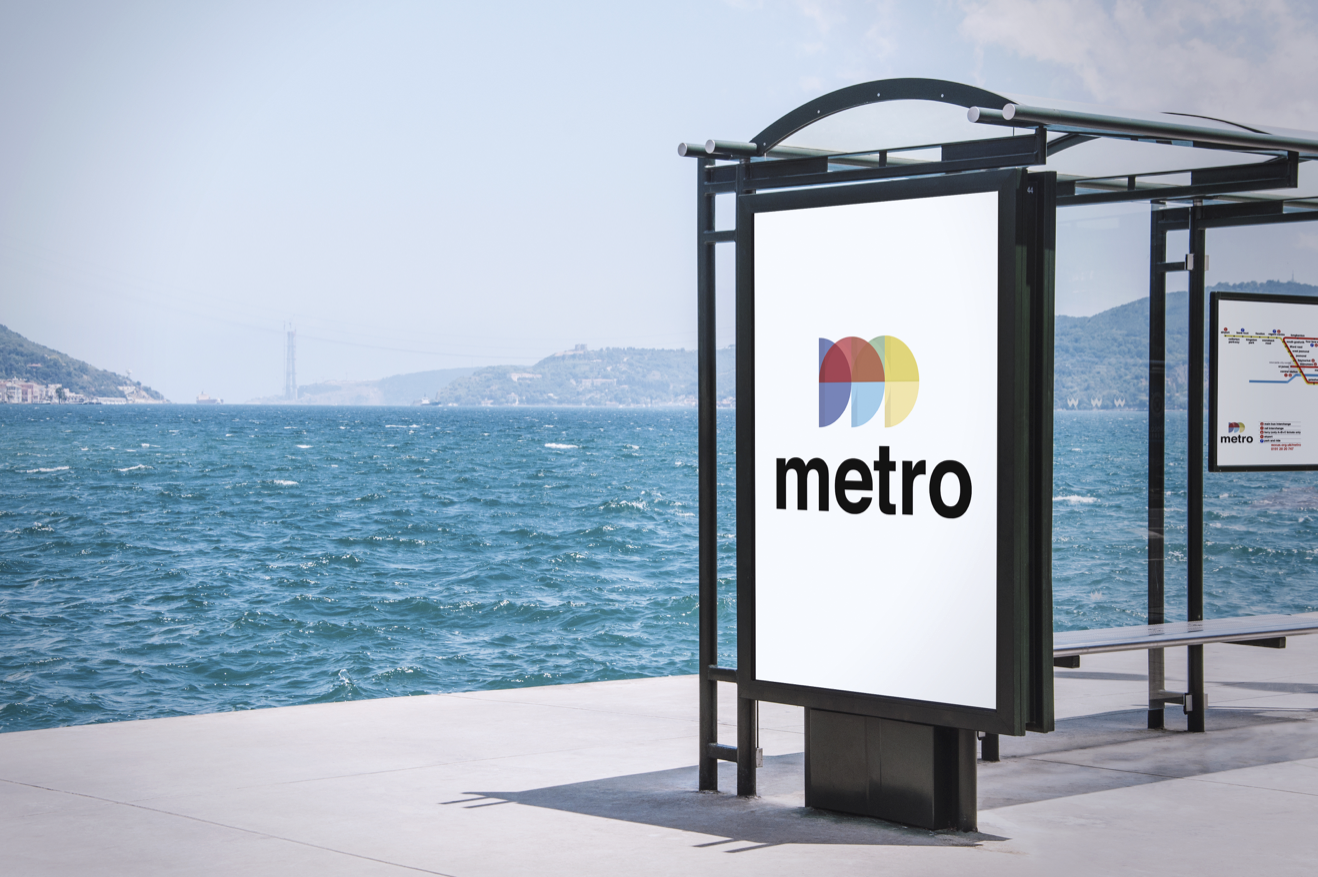
I am really happy with the final outcome of my logo, the colourful style and overall theme is what I was after from the start. Without research, initial ideas and development I would never of came to this logo. Each step helped me gather knowledge of logos that work and ones that don’t. The research into the New York City Subway was the most helpful as I wanted my logo to relate to that. I love the style of the M it just seems to work especially when it’s presented with the metro map. The map I also changed as it need to rated to the colour scheme of the logo, I love the map just as much as the logo. The designs are very crisp, modern and creative.
![]()

Mock Ups
I also wanted to mock my designs up on signage as it could add to the logos effectiveness. It would also relate to the signage from the New York system. I was happy with these outcomes as I thought my logo and map looked much better and cleaner.


Reflection
What did you enjoy about this module?
The main aspect I enjoyed about this module was researching into past designers and taking inspiration from them. I enjoyed researching into the New York Subway and seeing how that became so successful. I also enjoyed all my initial idea and developments. I really wanted a logo that was modern and very simplistic and I think I was successful at doing so.
What did you find challenging?
The part I found challenging was the development, Although it was fun to do looking back on the development they seem very bland and boring. This was because I didn’t use any colour or textures in my designs, if I done so this would of made my development stronger and more pleasing to look at.
What did you learn about your working process?
I learned a lot about linking my ideas to my research in this module. Its vital that any idea I put down on paper needs to be seen from my research. For example I was i inspired by colour and opacities in my research so I mentioned in my initial ideas and development that this was seen from my research pages. It also allows my tutors to see the working process and stages of my designs. It also helps me as I can always look back and see if my ideas compare to the ones I’ve been inspire by.
Can you identify areas for development?
The parts of my project that I think could be better is my development. Like I’ve said it didn’t include colour, textures or materials and this made this part of the project look boring. If I included these elements into my development it could of created more ideas. Development is all about experimenting and I didn’t do this so I will make sure I do this in the next project.
Were you happy with your final outcome? (Explain why/ why not.)
I was really happy with my final outcome it was what I aimed for from the start of the project. I really like the way it worked on the mockups of the signage and bus stops. I like the way the metro map turned out as I redesigned the whole thing on illustration. This took time but was enjoyable at the same time. I was happy with all my research and ideas and I wouldn’t change much of the project If i had to do it again.
What advice would you give yourself for the next module?
I would tell myself to be more creative and messy when coming to the sketchbook. I think I was to digital based and too neat I need to probably let myself go a bit and add some paint of colour to my book. I also need to experiment more in the development stages this would make the ideas stand out more and possibly give me more ideas for the outcome.
